

Are Australian households running out of spending power?
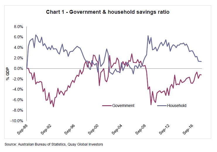
What does it mean?
Much has been said regarding Australia’s weak wages growth – yet the economy continues to muddle through. Retail sales, employment growth and GDP limp from one quarter to the next, recording moderate gains. Much of this is derived from the fact that since 2014, the rate of saving for households has steadily declined (adding to household purchasing power from one period to the next). Unfortunately this is unsustainable, as we have built in our economy a forced savings mechanism – superannuation.
Unless wage growth turns around or the federal government proactively lifts the fiscal deficit, household spending will curtail.
Long-term demographics in Australia is good for real estate
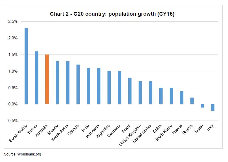
What does it mean?
More people equals more shoppers, homeowners and office workers. Among the G20, Australia has near ‘emerging markets’ levels of population growth. Yet unlike emerging markets, the population is growing into ‘first-world’ wages and income. This is positive for long run spending power.
Debate has now re-emerged about the economic and political impact of Australia’s population growth. Is this type of growth sustainable, or will political forces cap future immigration? Time will tell. However, we suspect each side of the political divide probably gets the same advice from Federal Treasury – the risk of a politically suicidal recession is minimised with strong population growth that supports real GDP growth (even if per capita GDP is falling).
But population growth may not be enough to absorb dwelling supply in the near term
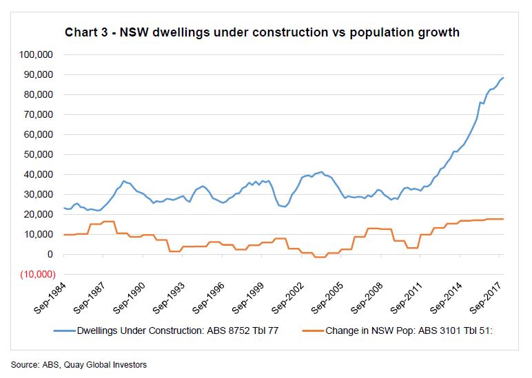
What does it mean?
There is little doubt the supply of new dwellings, particularly across the east coast of Australia, is running well ahead of long-term averages. The counterargument to the ‘too much supply’ narrative is strong population growth. However, Australia has had strong population growth since the early 1980s, and while it has increased recently, there still seems to be a mismatch. Prices will surely continue to adjust.
Which means the Australian construction industry is booming; but the hangover may cost 250,000 jobs
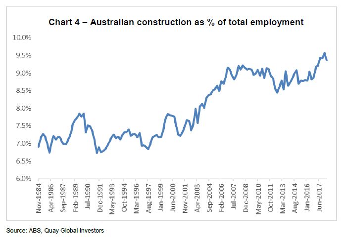
What does it mean?
A by-product of the current real estate, mining and infrastructure boom has been the surge in employment across the construction industry, which has in turn supported employment growth across the wider economy. As the real estate cycle ends, there is meaningful downside risk to employment. For each 1% decline in employment share 125,000 jobs will be lost. At a time when residential construction is peaking and prices are falling, this is worth watching.
Conversely, the US construction industry is operating below last cycle, and appears to be suffering capacity constraints
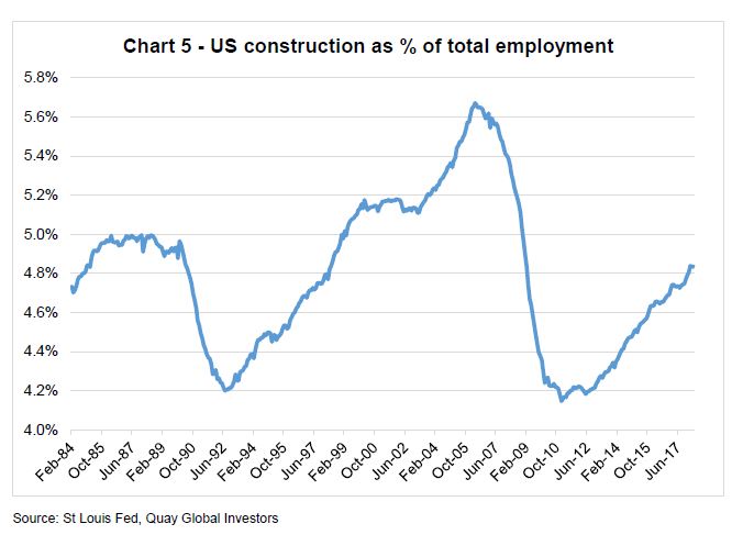
What does it mean?
Following the collapse of the US real estate and construction industry in 2009, there was little incentive (and opportunity) for school leavers to gain employment. The impact of the financial crisis is still with us today, resulting in a diminished construction sector that is already suffering from capacity constraints. Building costs are rising across the country (above double digit in the west coast) which will ultimately change the development equation for most real estate sectors. This bodes well for positive long-term rent growth.
A surprise lift in US inflation is unlikely unless there is a surge in property rents
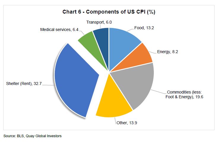
What does it mean?
There has been much hand-wringing in financial markets about the return of inflation. Any hint of rising inflation is generally accompanied by a sell-off of long-dated bonds and so-called ‘interest rate sensitive’ sectors like REITs. However, given around a third of US CPI is based on housing rents (direct rents and ‘owners equivalent’), a sharp increase in CPI could be better for housing dominated REITs than the market is pricing.
There is pent-up demand for residential accommodation in the US
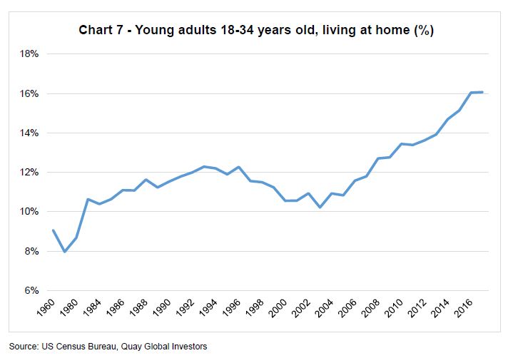
What does it mean?
Since the mid-2000s, structural elements have pushed young people to live at home with parents for longer. Student debt, limited employment prospects post-GFC and housing affordability have conspired to delay around two million young adults from forming new households.
Ultimately hormones will prevail, and young adults will leave the nest – most likely during good economic times (such as now). The result could be an additional demand for a million new houses or rental accommodation.
There is still slack in the US economy, suggesting a wage break-out is unlikely any time soon
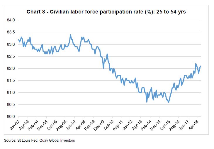
What does it mean?
Each month, the US economy adds around 200,000 new jobs. The concern is the economy is ‘running out of capacity’, and the result will be wage pressure which may possibly result in accelerating inflation.
The above data suggests otherwise. The 25-54 age cohort are not as engaged in the labour market compared to pre-crisis. This suggests there remains some capacity for the economy to continue to add jobs in a low inflationary environment. In simple terms, a 1% increase in the participation rate (which would lift the ratio back to the pre-crisis levels) would add 1.3 million bodies to the workforce in addition to the natural population growth.
A sustained low interest rate environment will generally yield a low total return
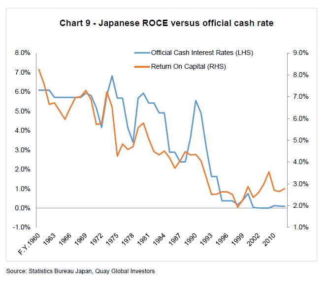
What does it mean?
In the short term, low interest rates are meant to be stimulatory and induce inflation. However, observers of Japan’s recent macroeconomic history have discovered otherwise.
While demographic challenges place Japan in a unique bucket compared to most developed economies, it can also be argued low investment hurdle rates have resulted in an acceptable lower return on capital over time. This not only yields poor results for owners of capital, but has the paradox effect of lowering consumer prices, ergo inflation.
UK Office demand is holding firm, but the Brexit impact is yet to be felt in key industries
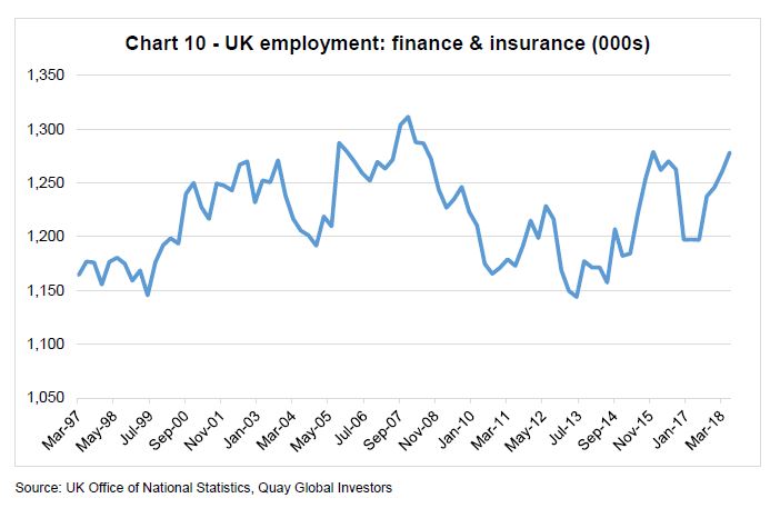
What does it mean?
Despite concerns that leaving the European Union will delay hiring decisions across the banking and finance industries (especially in London), it appears the industry is no longer interested in waiting and has begun to hire.
The result? Key real estate sectors like Office are yet to feel the impact of Brexit, which may be lulling investors into a false sense of security if current negotiations turn bad.
Taking the long view on the rate of return on everything – housing as good as equities?
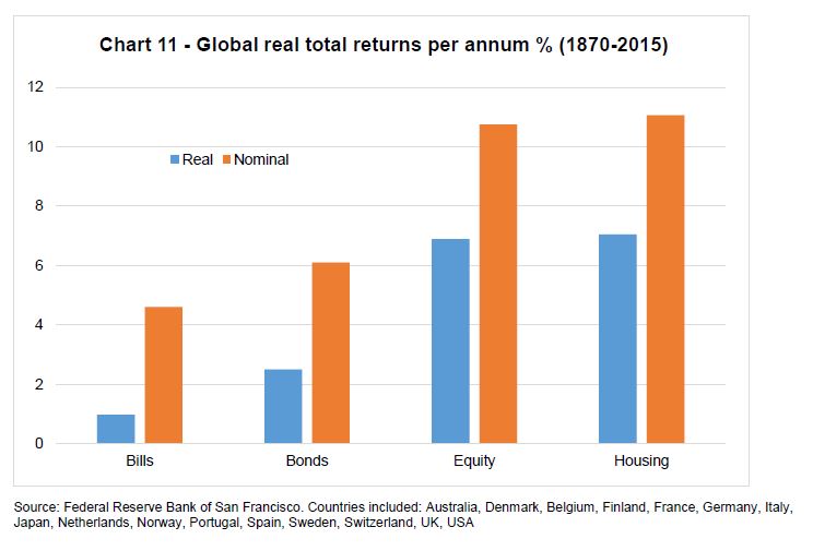
What does it mean?
The intuition of most people is correct. Despite the attraction and excitement of the financial markets and the promise of superannuation, the most effective and enduring form of wealth accumulation is via real estate (in this case, housing).
One can opine on the reasons why this may be the case. For what it’s worth, our explanation can be found here.
Technology is disrupting a record number of jobs – it’s just that the record is a new low
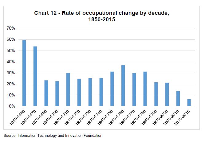
What does it mean?
While there has been much written and discussed about the breath-taking change in technology and innovation, the reality is job disruption has been getting progressively lower since WW2. The chart above measures the number of new jobs plus loss of old jobs as a proportion of all jobs (job churn).
The fact is that jobs are always being replaced by some type of new technology (horse & buggy drivers replaced by cars, washing dishes by hand replaced by the dishwasher). In the current climate of widely available information, maybe it just feels like there is more displacement. Or perhaps those being displaced today have the loudest voice (e.g. media).
Download a copy here.